From Digital Age to Nano Age. WorldWide.

Tag: Teardown

Robotic Automations

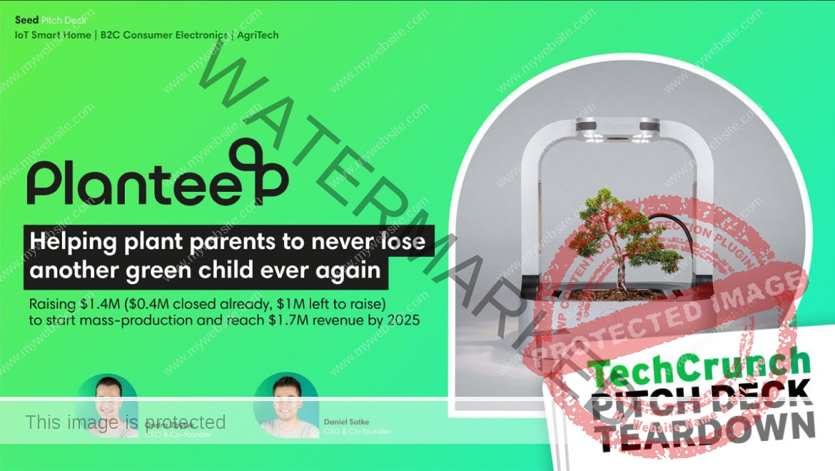
Pitch Deck Teardown: NOQX's $200K pre-seed deck | TechCrunch


NOQX is a Stockholm-based startup on a mission to help companies improve their goal-setting, collaboration mechanisms and experiences. It has just raised a $200,000 pre-seed round to help accomplish its aims and, by extension, help out companies with employee counts ranging from 50 to 500 or so. The company hasn’t been around for very long — the team behind NOQX felt frustrated by a lack of effective goal management tools for companies and founded the company in 2023.

With “clarity of objectives” as its rallying cry, NOQX addresses a critical function of any business — and indeed, of pitch decks — so I was intrigued to see how well NOQX communicates this for itself.


We’re looking for more unique pitch decks to tear down, so if you want to submit your own, here’s how you can do that. Read all the Pitch Deck Teardowns here.

Slides in this deck

NOQX’s deck has 18 slides, none of which has any redactions, although the company omitted its competition slide. An 18-slide deck should cover everything (most startups do just fine with 16), but there are some omissions that leave it incomplete.

  1. Cover slide
  2. Problem slide 1
  3. Problem slide 2
  4. Problem slide 3
  5. Solution slide 1
  6. Solution slide 2
  7. Solution slide 3
  8. Onboarding (“how it works” slide)
  9. Landscape slide
  10.   This Makes Us Unique slide
  11.   Roadmap slide
  12.   Traction slide
  13.   Go-to-market
  14.   Pricing
  15.   Target customer
  16.   Why Now? slide
  17.   Team slide
  18.   Closing slide

“Almost there but not quite”

In the past 90-odd installments of this Pitch Deck Teardown series, I’ve generally stuck with a “three things that are good” and “three things that can be improved” format. I tried ever so hard to do that for NOQX as well but eventually gave up.

The bold design of NOQX’s deck made me want to love it, but in truth, reviewing this deck was a deeply frustrating experience. Aside from the crucial omission of an Ask and Use of Funds slide (it’s not uncommon to get it wrong, but it should at least be included!), just about every slide in the deck felt almost very good — but then stumbled by not including a critical factor or overlooking an important detail. The deck is essentially so vague that it seems the founders don’t have a firm grip on why they are doing what they are doing.

You never need three problem slides

[Slides 2, 3, 4] That’s a lot of problem slides. Image Credits: NOQX

I was surprised to see NOQX break out three different problem slides. It is almost defensive, as if the company is desperate to convince investors that “Yes! I promise! There’s a real problem worth solving here!”

Investors are sharp. It’s far more effective to streamline this into a single, punchy slide. This approach spares everyone the boredom of repetition and sharpens the focus, ensuring the core issue shines without unnecessary fluff.

The problem slide should hit investors with a stark headline for a more compelling punch: “70% of companies are failing to achieve their goals” immediately sets the stage, signaling a significant and widespread issue. Below this headline, NOQX could have added three to five bullet points, each a mini-revelation on why this massive failure rate matters. These bullets need to pack a punch, highlighting the dire consequences for businesses and the economy, and the looming disaster if left unchecked. The idea is to make investors sit up and realize, “We can’t afford to ignore this.”

These bullet points should do more than just state the obvious; they need to align with what keeps investors up at night directly: opportunity and scalability. Each point should scream potential and profit, convincingly arguing why NOQX holds the golden ticket to a pressing, lucrative problem. By distilling the problem down to a single, impactful slide, NOQX would have cut through the noise, commanded attention, and made their case with the kind of clarity that demands a checkbook, not just a nod.

You also don’t need three solution slides

Saw this one coming, right?

[Slides 5, 6, 7] If you have too many solutions, you don’t have a solution. Image Credits: NOQX

From a storytelling point of view, it’s often worth divorcing the “solution” slide from the “product” slide. In this progression of slides, Slide 5 is kinda-mostly a solution slide, Slide 6 is kinda-sorta a value proposition slide, and Slide 7 plays the role of a product slide — but none of the slides are convincing.

Identifying the slides properly means that it becomes much easier to know what to include.

For a solution slide, it’s crucial to clearly articulate how your product or service solves the problem you’ve identified. This slide should succinctly explain why your solution is superior to existing alternatives. It’s worth keeping this part strategic and high level: You’re about to dive into the nitty-gritty on the product slide.

For the value proposition part of the story, founders must clearly define the unique benefits the product or service offers and why it stands out in the market. This slide should succinctly communicate what makes the startup’s offering valuable to potential customers and what differentiates it from competitors. It needs to highlight the distinct advantages it provides, such as cost-efficiency, superior technology, enhanced features or better user experience. In this case, NOQX’s value props are a bit of a nothingburger — fine at first glance, but not differentiated enough to really stand out from the competition.

For a product slide, you get to dive in and show the actual features and functionality that will help your customers get value from your product and solve their problem. Apart from the fact that “our awesome platform” is a bit cringe, it doesn’t actually say anything. Every startup in the world could say “our awesome platform,” which means you’re wasting that slide real estate for nothing. What is awesome about it? Why should investors care? How is it different or unique?

What is this slide trying to convey?

[Slide 8] A timeline to confusion. Image Credits: NOQX

I love a good timeline slide that shows what companies are trying to accomplish. Instead, this slide fails to understand who it is talking to. Perhaps this slide works in a sales deck when the founders are trying to explain its value to customers, but for an investor deck, this seems a little superfluous.

Overall, this slide falls between “how it works” and “value prop.” It’s not doing a great job at either, and it fails to meet the overall criteria for what to include in a pitch deck: Will this help you raise money? My gut sense is “no.”

This isn’t traction

[Slide 12] Traction is the past. Image Credits: NOQX

I love how colorful and visually appealing this slide is. What it is not, however, is a traction slide.

If you don’t have revenue yet, your traction slide should outline what you’ve done to de-risk the company. This slide not only fails to do that, but it also goes to December 2024. Your traction, per definition, is just about the past: accomplishments and milestones achieved to date. Ideally it’s presented as charts and graphs that show that growth is solid and accelerating. This looks like there isn’t any traction in the business. That makes sense; it’s a young company. But don’t try to trick your investors; they’ll see right through this, so just be upfront.

But all is not lost. This slide is sort of a “use of funds” slide, showing what the company is planning to do in the near future. That would be helpful, but it should have clear time goals around when it is planning to hit those milestones and what it needs to do to get there. “Smart investors” and “repeatable sales process” are important steps along the way, but they are obvious. Investors want to know what you’re going to do to get those investors and sales processes.

Why now, indeed

[Slide 16] Why, oh, why? Image Credits: NOQX

Having a great “Why now?” slide can help create FOMO and a sense of urgency. This slide just doesn’t do that. It’s a great start, don’t get me wrong, but well-informed investors will know all of this; it doesn’t add anything to the conversation. I’d have loved to see some insights or some thought leadership here. Why was there a shift in organizational structures? What’s the impact of meetings evolving? What is the impact of a leadership style shift? What does “a flow” goal setting and cadence even mean in this context?

I feel like I’m missing something significant here. Perhaps this slide only works when it has a voice-over, but pitch decks need to stand on their own two proverbial feet. And that might mean that you may need more than one pitch deck: one for voice-overs and one for sending ahead.

Tell me why you’re awesome!

Your team slide is crucial and is doing a lot of heavy lifting in the context of an early-stage pitch. Let’s take a look at this one:

[Slide 17] A solid team, but I want more context. Image Credits: NOQX

There’s too much and too little going on in this slide. The slide has a lot of very small text on it, which I don’t love. It’s pretty conversational, which can work, but in this case, I think it comes up short.

“With a decade of experience in hyper-growth B2B-SaaS companies.” Yes, but which ones, and why is that relevant? The rest of the statement is a lot of words, but it’s not helping me, as an investor, ascertain whether the CEO is a great fit to build this company. Now I need to head to LinkedIn, but there’s no link, so I’m going to have to start Googling, and I’m finding myself frustrated; this could be so much easier and better.

The CTO’s bio is similarly frustrating: Senior developer at Klarna is impressive, but it isn’t clear whether the experience is directly relevant or overlaps with the mission, vision and products NOQX is pursuing. The rest of the bio doesn’t say much. Yes, of course you are a visionary leader who strives to break new ground and deliver exceptional experiences, but the same can be said for every startup CTO ever. Be more specific. Explain why you’re the gold-plated unicorn on a pile of unfair advantages and talents that lead me to believe I’d be crazy not to deploy money into this startup.

And finally, if your head of UX is a co-founder, we need to have a conversation about whether that makes sense. And if she’s not, what is she doing on your team slide? As an investor at the earliest stages, I’m investing in the founding team and its ability to build a solid team. I don’t need to know the team itself quite yet.

Why so vague?

[Slide 13] This could have been copied out of a business textbook. That’s not a good thing, because all the specifics are missing. Image Credits: NOQX

Overall, the whole pitch deck seems really vague and nonspecific, which makes me (and investors) suspicious. Is it vague by accident, and if so, will this startup be able to explain what it is doing as it is growing and evolving? Worse, is it vague on purpose, because the founders know they’re not a great fit with the industry they are trying to enter?

Take this go-to-market slide, for example. This is barely even a brainstorm; it just outlines a generic sales process. Cold calling and email marketing: Yes, but where will it find its customers? What’s the top-of-funnel? What are the conversion rates?

Investors want to know who you are, what you’re doing, why you’re doing it, and how you’re thinking about the market and building a (potentially) multi-billion-dollar company in this space. They want to know who your customers are, what their existing options are and how you’re different. They want to know how you find and reach out to your customers, and they want to know how much you’re expecting to pay to acquire a customer, and how long you’re expecting them to stay around, and at what value.

None of those things are obviously present in this deck. That means that if I were to take a meeting with this startup, I’d have a lot of very pesky questions for them, such as:

  • Why are you the best people in the world to start this company?
  • What’s your moat / how is this defendable?
  • Who are your customers, and how are you going to reach them?
  • What’s the competitive landscape, and how are you different?
  • What’s your business model? How will you attract, convert and retain your customers?

All in all, the deck looks so good, but it lacks substance. Hopefully the company can figure that out ahead of raising its next round, or it may be in for a truly nasty surprise.

The full pitch deck


If you want your own pitch deck teardown featured on TechCrunch, here’s more information. Also, check out all our Pitch Deck Teardowns collected in one handy place for you!


Software Development in Sri Lanka

Robotic Automations

Pitch Deck Teardown: Queerie's $300K pre-seed deck | TechCrunch


Queerie is a dating app aimed specifically at LGBTQIA+ folks. It’s a very early-stage company that’s raising just $300,000 — a round size that typically falls into the “friends and family” category.

Dating is a fiercely competitive space, and there’s been a fair amount of M&A activity over the years, so I was eager to take a closer look.


We’re looking for more unique pitch decks to tear down, so if you want to submit your own, here’s how you can do that

Slides in this deck

Queerie shared its full, unredacted, 13-slide pitch deck with TechCrunch.

  1. Cover slide
  2. Cover slide part 2
  3. Mission slide
  4. Problem slide
  5. Solution slide
  6. Market size slide
  7. How it works slide
  8. Traction slide
  9. Competition slide
  10.  Team slide
  11.  Ask and Use of Funds slide
  12.  6-year (!) financials
  13.  Contact slide

A couple of things to love about Queerie’s pitch deck

The first thing that struck me about Queerie’s deck is that it feels fresh and fun. The use of language and graphics is clean, simple and engaging. A great starting point for a consumer brand!

Lead with the mission

[Slide 3] I love a good rallying cry. Image Credits: Queerie

If you’re trying to make the world a better place, you’re probably going to attract mission-aligned investors. So why not spell out your mission front and center? It’s a powerful storytelling technique that’s well executed in the Queerie deck.

Talk about a hard-hitting problem

[Slide 4] That’s certainly a problem worth solving. Image Credits: Queerie

This problem slide gave me pause: It stood as a reminder that in a lot of places, isolation and mental health challenges are rife in queer spaces.

The company is positioning itself less as a dating app and more as a solution for loneliness. Whether investors will buy it and whether this app is the right solution to the problems the company identifies are separate questions. What is certain, however, is that the problem Queerie outlines is one worth solving.

Four things that Queerie could have improved

I really want Queerie to exist, so it pains me to see that the way the company is pitching makes it essentially unfundable.

Is this the right team?

I see at least one dating app pitched every month, which makes sense: Dating and finding the right partner(s) is an important part of many people’s lives, and it seems like such an easy thing to do better than what’s currently out there. The upshot is that many of these startups have founders with a lot of experience in the dating world.

[Slide 10] Hello Quuties. Image Credits: Queerie

But where are the women? For a company that’s building an “inclusivity-designed platform,” that seems like a bit of an oversight.

There’s some interesting experience here, but most of the people seem almost too senior for this startup. I know that’s a rare thing to complain about, but one of the CTOs has been a site reliability engineer at Google for 18 years. That’s a very specialized job, and while scaling an app like Queerie is going to be important, I’m finding myself doubting how much overlap there is between scaling Google’s infrastructure and scaling a site like Queerie.

Overall, from reading the team’s LinkedIn profiles and what’s on this slide, I find myself concluding that they might be able to build a really good, well-functioning app with a great user experience — but that isn’t enough to build a successful company. There is a huge gap on the sales and marketing side, and there’s not a lot of startup experience across the team either. If this slide could add a seasoned marketeer with consumer marketing app experience, I think the team would be more believable right out of the gate.

This is just describing a dating app

I really don’t understand what this slide is trying to accomplish:

[Slide 7] Yes, that’s a dating app. Image Credits: Queerie

This slide is a bit of a waste. It doesn’t show any of the secret sauce for why Queerie is going to be successful where others have failed; there’s nothing new or innovative here.

Slides in a pitch deck should help an investor decide to invest. If someone reads the slide and it’s likely to be neutral (or even negative), it’s best left out.

That’s not traction

[Slide 8] This isn’t really showing traction. Image Credits: Queerie

The company says it has a “closed version of the mobile app,” but this 13-slide deck doesn’t include a single screenshot of the app. The company says it has 95 beta testers, which is great, but that isn’t really “traction.” Traction would be how these beta testers are interacting with the platform. Are they paying? What are the DAU/MAU (daily/monthly active users) stats?

I’m writing this on March 31, which is the last day of Q1 2024, so I’m confused why the company says it surveyed 3,000 people in Q2 of 2024? The company also says it is planning to grow the initial user base with “strong growth” in Q3, but then says it is launching the app in June, which is in Q2. This isn’t a huge deal, but it is a little confusing.

Fundamentally not venture scale

This slide, which describes how quickly the company wants to grow, raises some red flags.

[Slide 12] This is not a startup. Image Credits: Queerie

After the first year, the company is only planning to spend $40,000 per year on app development. That doesn’t even get a half-decent part-time developer. For a company that’s a tech startup, that’s a terrifying oversight: Is the company not planning to continue to develop its apps?

The growth here is way, way too slow. Elsewhere in the deck the company says it will acquire 1,000 users in the first half of 2024, but then it’s going to hit 20,000 monthly active users by the end of the year. Then suddenly the growth drops to “merely” doubling in 2025, and doubling again in 2026. For a hypergrowth early-stage startup, those numbers are awful. Startups typically want to be growing 10% week-over-week in the early stages. If you start with 1,000 users, after a year of 10% week-on-week growth, you should be at around 130,000 users:

10% week-on-week growth with a 1,000 user basis looks like this. Image Credits: TechCrunch / Haje Kamps

Even worse, however, with the current six-year financials, Queerie is planning to do just under $10 million of revenue in 2029. That’s pretty dismal and indicates that the founders don’t have a particularly aggressive growth plan in place. Its own numbers show that it only expects about 15% of its customers to be paying $8 per month.

Elsewhere in the deck, the company says, “Our mobile app will allow us to expand to more cities as we raise more capital,” which is awesome, but the financial overview doesn’t show more fundraising happening in the business, so it’s unclear when or how much the company is planning to raise.

In a nutshell, this slide shows that Queerie could be a pretty successful lifestyle business, but I fear that no investors would go anywhere near this as an investment; it’s too unambitious, and it shows that the company’s founders don’t understand what is expected of them as startup founders.

The full pitch deck


If you want your own pitch deck teardown featured on TechCrunch, here’s more information. Also, check out all our Pitch Deck Teardowns all collected in one handy place for you!


Software Development in Sri Lanka

Robotic Automations

Pitch Deck Teardown: Plantee Innovations' $1.4M seed deck | TechCrunch


It’s rare that I come across a pitch deck that ticks almost all the boxes. It’s so good, in fact, that I fed Plantee’s deck into an AI tool I built, and it determined there was a 97.7% chance that Plantee would raise money. This tool generally determines that only about 7.5% of all pitch decks are up to scratch, so Plantee’s is positively off the charts.

What the robots didn’t pick up, however, was that Plantee’s Kickstarter campaign was canceled before it was completed, and there are a few other confusing bits as well. Let’s dive in to see what works, and what could be improved.


We’re looking for more unique pitch decks to tear down, so if you want to submit your own, here’s how you can do that

Slides in this deck

  1. Cover slide
  2. Summary slide
  3. Team slide
  4. Advisers and investors slide
  5. Mission slide
  6. Market validation slide
  7. Problem slide
  8. Solution slide
  9. Product slide
  10.  Competitive landscape slide
  11.  Traction slide
  12.  Target customer slide
  13.  Market size slide
  14.  GTM slide
  15.  Pricing & unit economics slide
  16.  Vision slide
  17.  Ask and Use of Funds slide
  18.  Operating plan slide
  19.  Closing slide
  20.  Appendix slide I: Products in development
  21.  Appendix slide II: Sources and references

Three things to love about Plantee’s pitch deck

It turns out that Plantee’s team has been reading my Pitch Deck Teardowns very carefully indeed, and it shows. The company includes tons of details in its deck.

That’s how you do an introduction!

Slides 1 and 2 together (Slide 1 is at the top of the article) set the stage for an investor to 100% understand the what, why and how of the company:

[Slide 2] A one-page summary to applaud. Image Credits: Plantee

The opening slides of Plantee Innovations’ pitch deck are rock solid. Between the two slides, the founders offer a clear and engaging introduction to what the company stands for and aims to achieve. The succinct overview captures the audience’s attention right from the start but also serves a dual purpose of efficiently level-setting for investors and filtering interest based on investment thesis alignment. The cover slide includes “IoT Smart Home / B2C Consumer Electronics / AgriTech / Raising $1.7M” — it’s basically keyword bingo that helps investors decide whether to lean in or whether to trash the deck right away. That’s a good thing: If this company isn’t a good fit with investors, they can move on right away.

Gotta love a good tech solution

I’ll be the first to admit that I’m a raging nerd, and I love a good gadget. I also love plants; I have dozens all over my apartment, and I can keep most of them alive. As outlined, I love Plantee’s approach to foolproofing plant parenthood.

[Slide 8] Technology, AI and happy plants. Image Credits: Plantee

I’d hazard a guess that most plant owners think about light exactly once: when they first bring the plant into the house. They’ll think of watering as often as they can, hopefully before the plants are a dry, crispy, sad mess on the corner of the dresser. I’m glad there’s an AI taking care of all the other stuff, because I had no idea plants needed so much!

On the one hand, that’s a relief. On the other, perhaps I’m just a naive and novice plant daddy, but it left me a little confused. I’ve never heard anyone mention air humidification and soil heating. I could be persuaded that these things make a difference, sure, but I’m definitely curious to what degree it’s worth worrying about.

A good competitive landscape

This is a market that doesn’t have many competitors. Seen through one lens, that’s a good thing: It means that there’s a thriving market, and Plantee can see what its competitors are doing well or poorly and position itself accordingly.

[Slide 10] That’s a lot of competitors. Image Credits: Plantee

As a competitive overview slide, this is pretty comprehensive. It separates the competitive landscape into “hard to grow” and “easy to grow” and specialist (e.g., mushroom/avocado growers) versus generalist growers. That all makes sense, but there’s still a little piece of the puzzle missing here: The only real exit in this space that I’m aware of is ScottsMiracle-Gro’s acquisition of AeroGarden, for around $50 million. Not the world’s smallest acquisition, but not wildly encouraging, either.

The other question I have is whether this dichotomy even makes sense. If someone plants a bonsai — a specific use case pitched by the Plantee team — they’re probably not going to repot the plant, which is an interesting challenge. If you’re positioning yourself in the market as a “you can grow anything,” I would assume that you’d want to replant occasionally. The little bonsai tree, however, can grow up to 800 years, so it’s hard to claim that the “grows all plants” argument is that strong of a selling point.

Three things that Plantee could have improved

On first impression, the Plantee deck is pretty extraordinary, and the AI tool gave it a 97% chance of success. As a human investor, I’m less convinced, and I disagree with the AI for a few crucial reasons.

Does it make sense as a product?

I love a good indoor growing system, and there have been many that tried (and failed) in this space. GROW raised $2.4 million back in 2017, before it eventually ground to a halt. I reviewed the $1,000 Abby a couple years ago, which, like Plantee, had pre-sold $100,000 worth of products on Kickstarter, and it was pretty awful. I’ve also built my own hydroponics system for under $150, which is obviously a lot more work, but it shows that these types of systems don’t have to be expensive.

Plantee is up against some pretty formidable competition. At the low end, for just $40 you can pick up a pod-based hydroponic system. If you want to spend a bit more, Click & Grow has your back. Rise Gardens recently raised a $9 million round. People kill house plants all the time, but most of them are pretty easy to take care of. If you need some help, a quick Google search for “AI plant growing app” gives you dozens of options, most of them free.

My biggest challenge with the Plantee deck isn’t what’s there, but it’s what’s missing: wider context. If you take all the company’s claims at face value, it’s an extraordinary opportunity. However, zoom out a little, and talk to a few plant lovers, and you realize that perhaps there isn’t as big a gap in the market as one might think. It seems that the inherent assumption in the Plantee story is that people who are bad at plants will spend $1,400 on a fancy automatic plant pot.

I’d argue that’s a fallacy and that people who are bad at plants instead get a kitten, or take up watercolors, or get a plastic plant, before they’re wiling to invest four months of car payments on a fancy piece of tech.

So what happened to that Kickstarter campaign?

[Slide 11] Plantee is arguing front and center that its Kickstarter campaign is part of the market validation. But there’s a catch. Image Credits: Plantee

Plantee did, in fact, persuade 109 backers to pledge just over $100,000 for its product. The campaign was fully funded in less than eight hours but was canceled just under a month later.

What happened? Image Credits: Screenshot from Kickstarter

That puts the Plantee team in a strange position: It claims that the Kickstarter campaign proves market validation. And that might be true: The company says it was able to attract its preorder customers for a CAC of $275. By selling 109 units, basic math dictates that the company spent about $30,000 to make $100,000 worth of sales. That’s not too shabby, assuming that there’s enough margin in the product to make that customer acquisition cost make sense.

The problem, however, is that the company doesn’t mention anywhere in the pitch deck that the campaign was canceled, and it doesn’t discuss why it was canceled. It could argue that it never intended to deliver on the Kickstarter campaign and that it was just a marketing test to help confirm whether there was a market for this sort of thing.

I’m not sure that makes sense. Before Plantee’s campaign, EcoQube ($300,000 funded in 2019), GroBox ($70,000 funded in 2019), Herbert ($280,000 funded in 2019) and dozens of others had already been successful, and it’s not fully clear what Plantee learned from this exercise. Since then, a bunch of others have run successful Kickstarter campaigns (Herbstation, MarsPlanter, GrowChef).

Put simply, I’m struggling to figure out how the Kickstarter campaign fits into the overall narrative, and by seeming to skirt the issue within the deck, Plantee isn’t doing itself any favors. Perhaps I’m being painfully sensitive after one of my own Kickstarter campaigns went down in flames a decade ago, and eventually took the whole company with it, but personally, I’d include a “so, what happened with the Kickstarter” slide in the appendix to get ahead of that part of the story. Bad news should travel fast.

A little on the dramatic side

I love some good storytelling, don’t get me wrong, but parts of this pitch deck seem to have lost all perspective. Phrases like “never lose another green child,” “It started when my good friend died,” and “stress affecting the mental health of growers” are undoubtedly powerful and emotionally charged, but to those of us who’ve lost a good friend, had serious mental health challenges, or actually lost a human child, it seems pretty tasteless to compare the vast and almost unbearable pain of that with losing a house plant.

[Slide 5] I’m sorry for your loss, Ondra, but this is bordering on bad taste. Image Credits: Plantee.

The full pitch deck


If you want your own pitch deck teardown featured on TechCrunch, here’s more information. Also, check out all our Pitch Deck Teardowns all collected in one handy place for you!


Software Development in Sri Lanka

Back
WhatsApp
Messenger
Viber